Who We Are
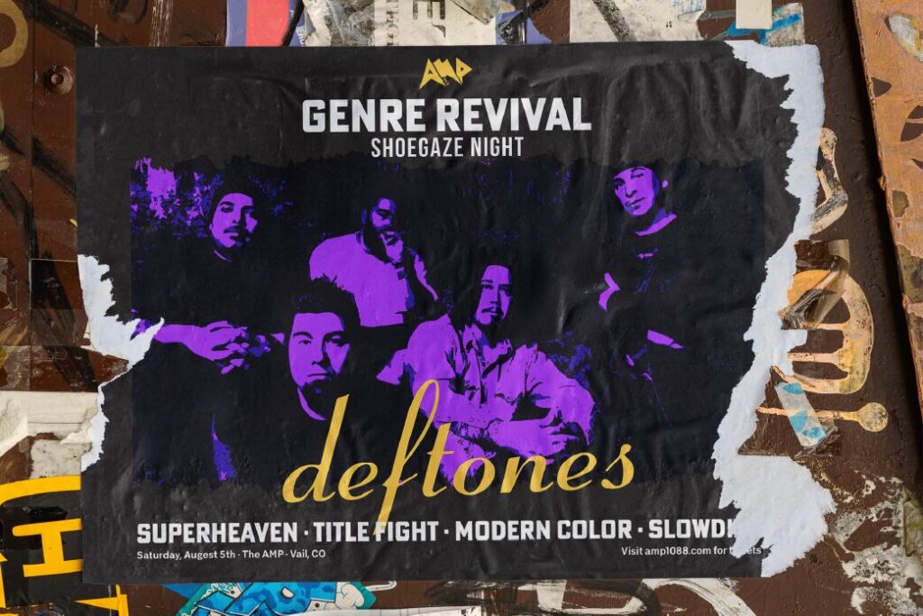
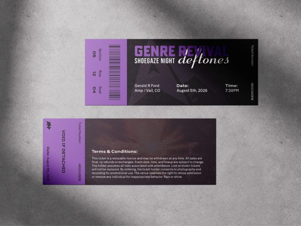
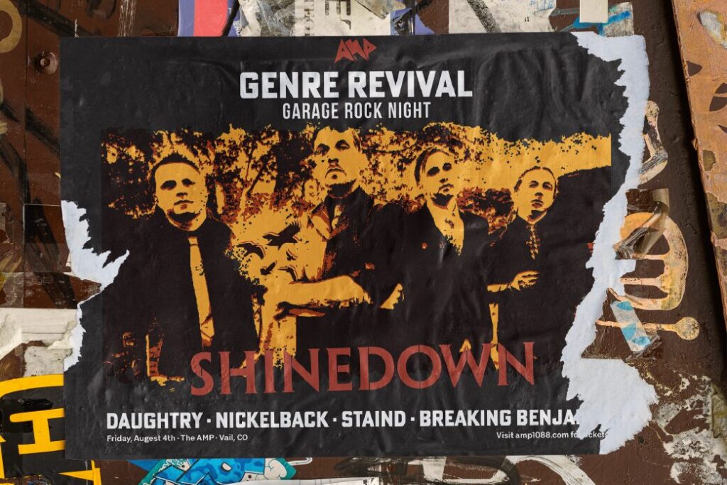
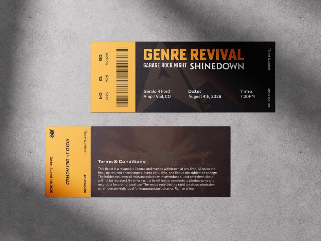
AMP is a high-energy brand concept centered around sound, movement, and visual intensity. Built to reflect modern music culture and digital experiences, the identity leans into bold typography, sharp contrast, and rhythmic design elements. The goal was to create a system that feels loud, fast, and instantly recognizable across both digital and physical touchpoints.
Highlights
- Brand identity & logo design
- Typography-focused visual system
- Album/cover art direction
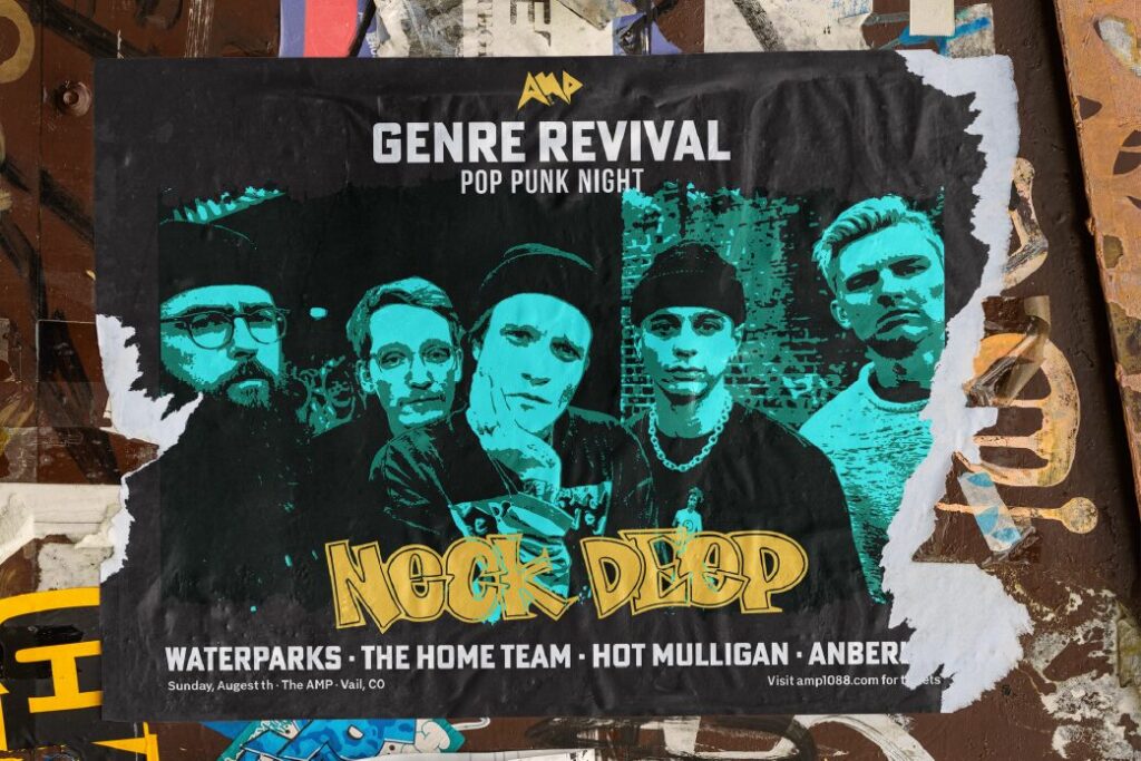
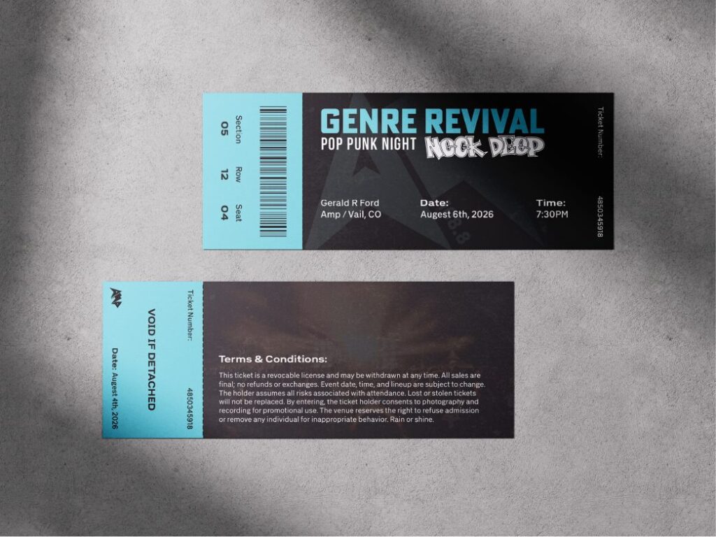
- Event & promotional assets
- Social media visuals & motion direction
The Process
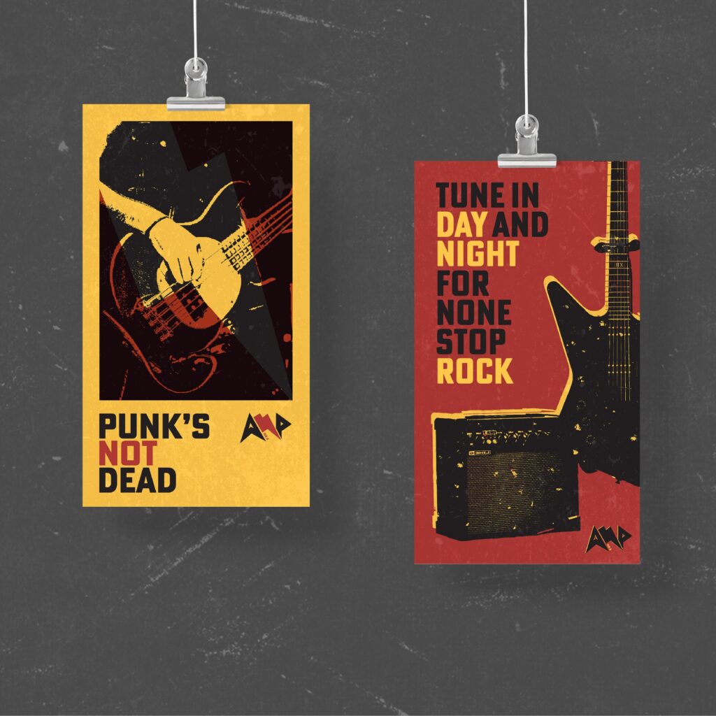
The AMP project started with exploration into music-driven branding and high-energy visual trends. I focused on capturing the feeling of rhythm and amplification through strong type, contrast, and layout. Early concepts experimented with distortion, repetition, and grid-breaking compositions to create movement. From there, I refined the system into a cohesive identity that could scale across album artwork, promotional materials, and digital platforms while maintaining a consistent, impactful look.